
We want our websites to look gorgeous, work properly and help our customers with their needs, thus making our business successful and prosperous. So are there any common rules we can follow to make sure we are using the best practices and keeping up with the standards?
Of course, there are. Let’s jump into the fundamentals today and see how we can make the layout of our websites better.
First things first: we do love design trends. We love talking about them, sharing with the community and applying them in our work. But one thing to keep in mind is that your design should be appropriate. Eventually, it should help your customers find answers to their questions, complete tasks, achieve their goals. And the task of your design is to help users and not to interfere with them.
So, what are these web layout patterns?
Cards and Lists
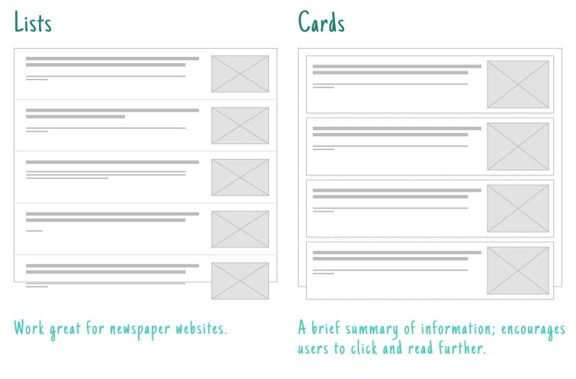
Cards seem to be everywhere nowadays. And their use is absolutely justified in certain situations. Cards contain content and actions about a single subject. Google Material Design Team recommends not to use cards when “a user is not directly comparing images or text.” So when displaying a newsfeed, it is better to use simple lists, instead of cards. Because users tend to scan pages quickly, just comparing news titles and to get an overview of the stories and pick those articles, which they want to read further.
Grids
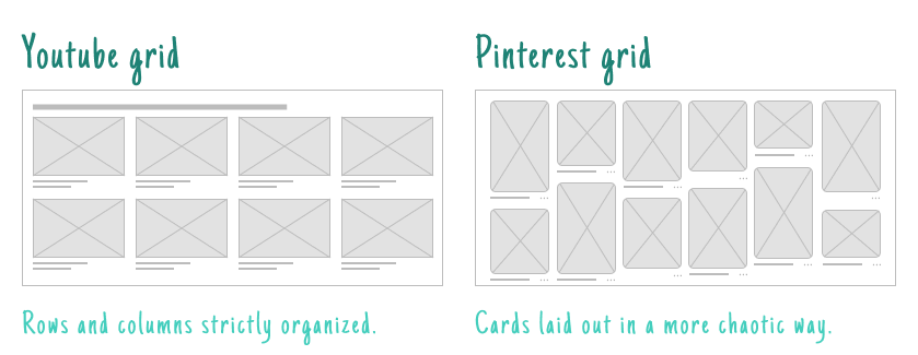
Remember Youtube Home Page? Videos are shown in a grid. Each row contains a certain number of videos, they are strictly organized and grouped into various categories.
Another good example of using cards laid out in a more chaotic way is Pinterest website. There is little white space between the cards, some content can slip away from the user’s attention. But the resource’s goal is to entertain users, rather than inform about something important. And this playful grid performs its duty just as needed.
Magazine-Style Layout
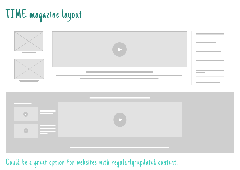
This is a great solution for websites with daily-updated content, which falls into various categories.
Keeping in mind that users can get bored or lost if a large amount of various content is displayed, it is our task to showcase it in such a way that will keep the interaction going. By changing sizes of columns and cards, we can break the monotony of the grid and catch users’ attention effectively. Typography also matters: use different text colors and sizes to show usability and build a visual hierarchy.
Split-screen
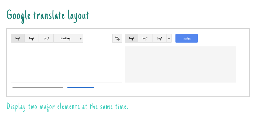
If the content of your website can be divided into 2 main sections (not necessarily equal, they can be even contradictory at some point), then you can go with a split-screen solution.
This solution offers a perfect way to display two major elements at the same time. If you can’t decide which of the two elements to display on the top of the page – show both of them.
Other options are to place an image on one half of the screen and add text on the other half. Or go even further and add two calls-to-action on both halves.
Single-page Layouts
Here is where the giants come in: Gmail, Twitter, Spotify and many others. Single page apps are very common nowadays. They allow users to experience a close connection with the system and feel in control of the situation.
SPAs (single page applications) use AJAX technology to load asynchronously and this enables them to commit several actions on one page.